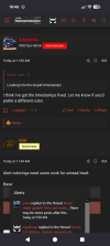
I don't understand the issue here. The dot is filled in when it's unread and empty when it's read. You can toggle between read/unread too. What sort of change are you looking for exactly?
I don't understand the issue here. The dot is filled in when it's unread and empty when it's read. You can toggle between read/unread too. What sort of change are you looking for exactly?
Do we want the chat widget to be on the home page, at the top of the forum page, and in a dedicated tab? I'm thinking we should remove it from the top of the forum page. @Raider, Thoughts? I'm fine with leaving it as is if you like it.
How it was originally was just on home page and on the dedicated shout page.
I think having it as it is now on the homepage and then filling out the shout page (more readable lines) with no shout on forum page brings us back to a nice parity. That's my vote, if it counts.
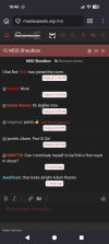
That's just because the site is responsive. Turn your phone to the side and the timestamps are not under anymore. There's just no room with a small screen in portrait.
That's just because the site is responsive. Turn your phone to the side and the timestamps are not under anymore. There's just no room with a small screen in portrait.
i almost never use my phone in portrait it's horrid. is there a way to just disable time stamps if portrait on mobile? or just insert them at the end of the text. I understand this is a different platform worked just fine in the old version and the box was bigger.
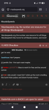
Any way the chat tab can be filled out a bit more? This is kind of ass compared to the near full screen the last shout tab had on the old site: View attachment 33292
The fat ass footer has as much space used as the visible shout area
I'll be transferring over some of the customization from the old theme, like making the chat window in the tab a bit bigger. You can also click the settings icon at the top right of the chat and enable maximized mode.
could we please add a light vs dark preference in the account preferences page? showed default dark on one device and not another, scrolling to bottom for mode change isnt intuitive to me, settings is.